Let’s be honest with ourselves. We’ve all seen those houses that make us do a double take for all the wrong reasons. Maybe the roof screams one era while the siding whispers another and the windows? They’re just lost. It’s jumbled like a beautifully written sentence with the punctuation all in the wrong spots.
But here’s the house. The house that makes you stop and stare and appreciate it. Everything just… works perfectly. There is a quiet yet strong presence. That magic is not a coincidence; it is the skill of uniformity. And today we are going to reveal the method of that magic for your home with the combination of siding, roofing, and windows into the story of your own.
Initially, get a sense of your home’s story (what’s the vibe?).
To prevent yourself from being in a state of confusion because of the large variety of paint colors and shingle samples, you have to do first this one thing:
Make a cup of tea, go outside, and have a thorough look at your house. I’m saying look at it without any preconceptions. Is it speaking of the classic New England charm, or is it all very tidy and modern?
The Classic Charmer: We’re talking Cape Cods and Craftsman. These old souls love a good, timeless palette. Think deep, dignified navies, forest greens that hint at secret gardens, or warm, welcoming taupes.
The Modern Minimalist: This residence is a proclamation. It revolves around clearly defined edges, strong contrasts (black and white is a strong move here), and substances that exude a smooth and deliberate nature—such as metal cladding and huge, seamless glass panes.
The Farmhouse Friend: This style is like a warm hug. It leans into soft, soothing grays, creamy off-whites, and the honest texture of natural wood. Throw in some black or dark bronze windows for a touch of that modern rustic edge.
Nailing down this personality is your North Star. It’s the secret to making every choice that follows feel instinctive, not forced.
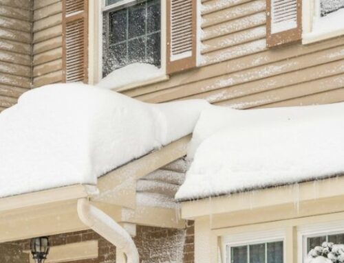
Your Siding: The Hero of the Story (But Every Hero Needs a Support Crew)
Your siding is the lead actor—it sets the stage. It’s the biggest block of color you’ve got, so the pressure is on. But here’s the thing…
Using Neutrals is Not Yawn-Inducing, but Intelligent. Whites, greys, and beiges are your closest allies. They are the best support act, making a beautiful, quiet canvas to allow your roof and windows to shine.
Want To Get Crazy? Go Darker. Deep charcoals, stormy blues, or deep sage greens can be totally stunning. Just remember, a strong siding color will also require you to pay attention to what plays off of it.
Beware the Undertone Trap! This is where the magic (or mayhem) happens. That lovely gray you picked? It might secretly have hints of blue, lavender, or green. Hold those siding samples right up against your brick and roof. You want a friendly conversation between the colors, not a back-alley fight.
The Roof: Your Home’s Crown. Make it Regal.
Your roof is that statement piece that pulls the whole outfit together. It is a big piece of your home that is likely a permanent fixture so everything else has to play nicely with it.
Think “Warm” or “Cool”. This is the “trick” of all tricks. A roof that has warm earth tones (brown, tan, terracotta) loves siding in the warm family of colors—creams, warm gray, beige. A cool roof (slate gray, black) is dying for partners in the cool family of colors such as whites, cool gray, and blue.
Contrast is Your Secret. There are good reasons why a light siding with a dark roof is timeless. It’s sharp, it’s defined, and it creates a lot of dimension for your home. The goal is not to clash, but to create a beautiful balance.
Get Physical with Samples. Seriously. There is no negotiating this. That color you thought you loved online could look completely different in the harsh noon sun versus the softened glow of evening. Get real samples. Hold them up. Leave them for the entirety of a day. You will thank your future self later.
The Windows: The Eyes of Your Home
This is where the personality really shines through. Your windows can either fade gracefully into the background or frame your home’s face with intention.
The Stand-Out: This is my personal favorite. Use the windows to create definition. Crisp white frames against charcoal siding? Timeless. The current darling—dark, moody black or bronze frames against a light exterior? Pure, modern sophistication.
The Secret Design Rule (Shhh!)
Ever heard of the 60-30-10 rule?Interior designers swear by it, and it works like a charm outside, too.
- 60% should be your Siding (the dominant color).
- 30% should be your Roof (the secondary color).
- 10% is for your Windows, Shutters, and Front Door (your accent pop!).
This formula is a safety net. It ensures balance so your home doesn’t feel like a chaotic color wheel.
And Don’t You Dare Forget the Front Door!
Your moment to impress has arrived. After all the meticulous organizing, you are able to bring joy at your entrance. An impactful red, a bright yellow, or a peacock blue can turn out to be that unforgettable, signature feature in your creation.
Then, what is the final decision?
This is not merely a matter of following the rules. Rather, it is about installing a feeling. It is thus, about standing in your house and witnessing a lovely story that seems to be whole, balanced, and, above all, yours. You are aware of what is right. In case your mix has the same effect on you as the smile on your face when you come back home, well done!